Questico
In 2000, Adviqo group created Questico. Questico offers websites, mobile apps and astro content all tailored to the consulting needs of each individual customer. With Questico, people find exactly the consultant that suits their personal needs. At the same time, the marketplace is a digital B2C platform for life coaches from different areas of life.
To comply with my non-disclosure agreement, I have omitted and obfuscated confidential information in this case study. All information in this case study is my own and does not necessarily reflect the views of Questico.
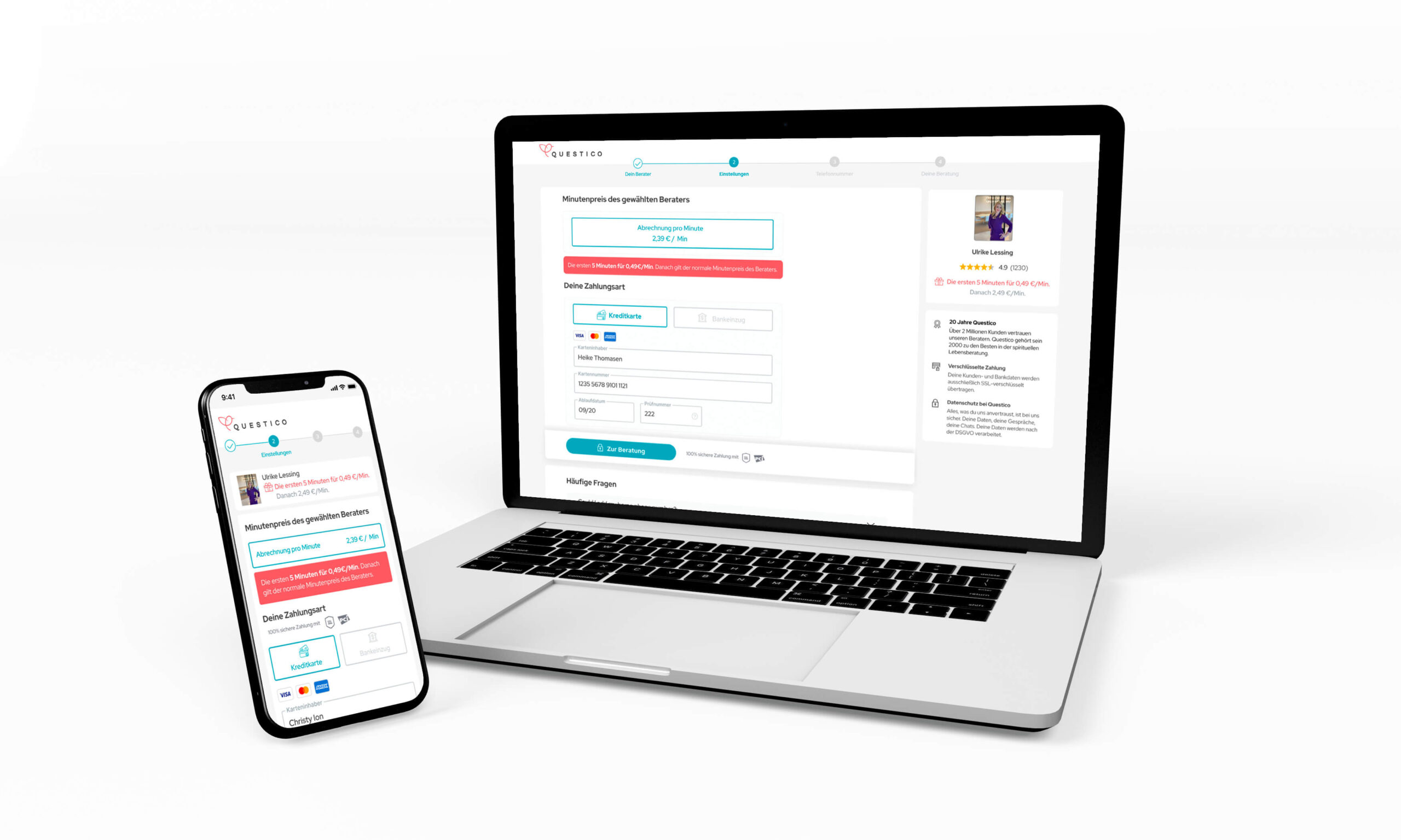
Design by accretion
In almost 20 years, Questico managed to be one of the most favorable platforms for users who are seeking of advice, not only in Germany, but the whole world. By 2019, Questico has 153,021 active users monthly.
Although the Questico — designed in 2000 –, performed well according to numbers, the fundamental usability of the product was challenged. Disparate features and experiments competed for focus. Product’s reliability and performance issues increased exponentially.
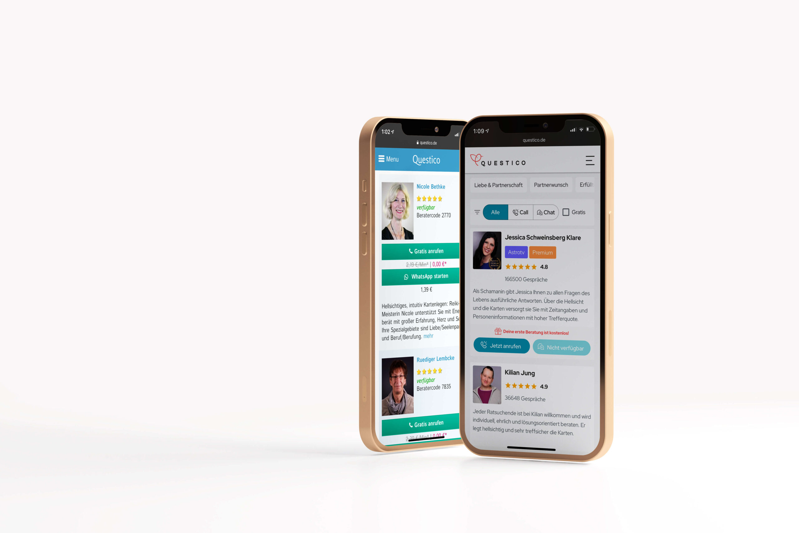
The evolution of the Questico from 2000 to 2020.
The Goal
Our goals for this project were:
- To redesign the whole product
- To increase the number of the registrations
- To increase the conversion rate from free to paid users
- To add new features
My Role
UX Designer of the Questico. Collaborate with one other UX designer from the beginning, 1st of March 2020, until today.
In addition, I work alongside many backend and front-end developers and 5 Product Managers. Also, I work closely with the content team which supports on the necessary translations and 2 graphic designers for some UI elements that were necessary.
Kickoff
First and foremost, I wanted to experience the existing flaws and based on the insights to identify which were the pain points of the product.
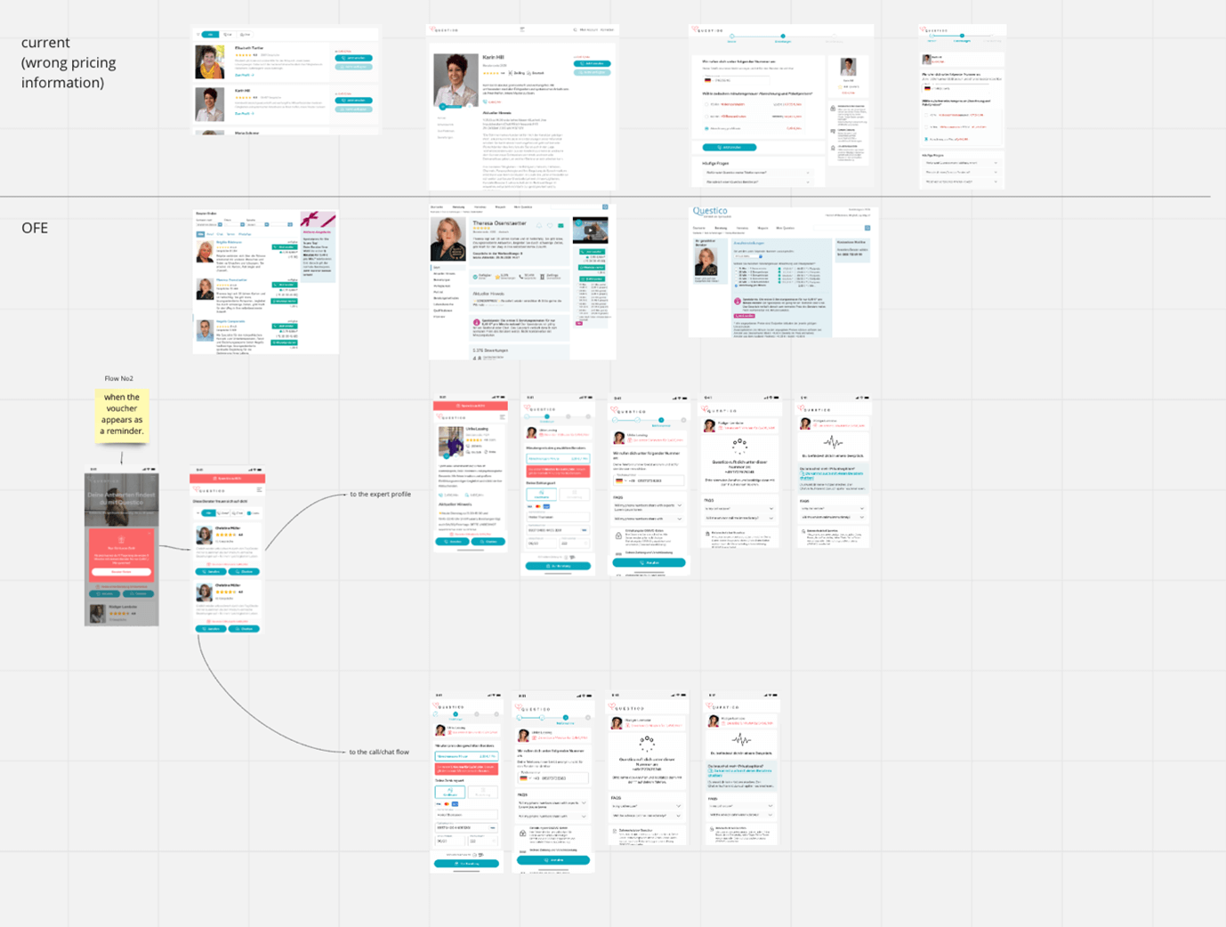
After investigating everything we started to work on:
- The call flows
- The chat flows
- The log in flow
- The registration flows
- The payment flows
- The additional payment methods we wanted to add
- The different promotions that CRM team sets
- The Homepage
- The FAQ and Trust building elements
- The “Mein Account” and the different features we wanted to add also there.
- The onboarding
The problem
So, after redesigning the whole product, we did some testing so we can identify what works and what doesn’t work properly. Within the testing phase we identified 3 major problems.
- We had a lot of Qustico offers you a free call with every registration and we noticed that fake accounts created in order to get advantage of this first free call.
- Quite a few bandonments noticed at the point where we are asking for the telephone number of the user.
- The number of mobile users increased and the number of the chat experience as well. The chat experience is still based on the old frontend though.
The solution
My solution to the first problem was to create the Double Opt In (DOI). A double opt-in occurs when a user signs up for an email marketing list, and then an email is sent out to the user which includes a link to click and confirm the subscription. By using a double opt-in confirmation method, the chance of spam addresses in the deployment list will be greatly reduced.
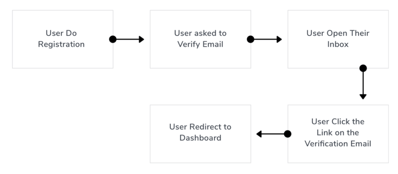
To achieve the completion of the task I try to guide the user, to make every single step clear and explanatory. This DOI is a switch on and off tool on the FE. We can either activate or deactivate its use so we can test what works better for us. Do we get enough registrations and verified users or not because of this interruption for the verification that we ask? Right now, out of the 140 registrations, 80 of those verify their e-mail within 2 hours. The rest of the users didn’t come back within 2 days. So now we aim to test again and again with some small changes all the time until we will find the solution that works better. It might be the case that the restrictions we imposed on using the free offer (double opt-in, email bouncer service among others) have caused a significant drop in free offer conversion rate. We will now adapt these restrictions and make them a bit easier to pass.
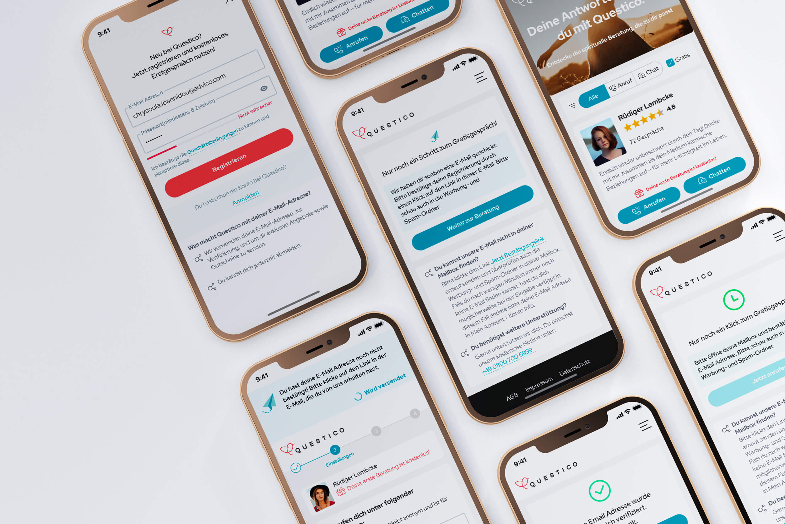
Current DOI flow
Another important information I would like to share with you is about the banner in the upper part of the screen. As a design system, I use the material io. According to the last one, banners should be displayed at the top of the screen, below a top app bar. They’re persistent and nonmodal, allowing the user to either ignore them or interact with them at any time. Only one banner should be shown at a time. In my case of Questico, I decided to add this banner above the header exactly because below the header we have the steps that a user needs to follow in order he/she to complete a task.
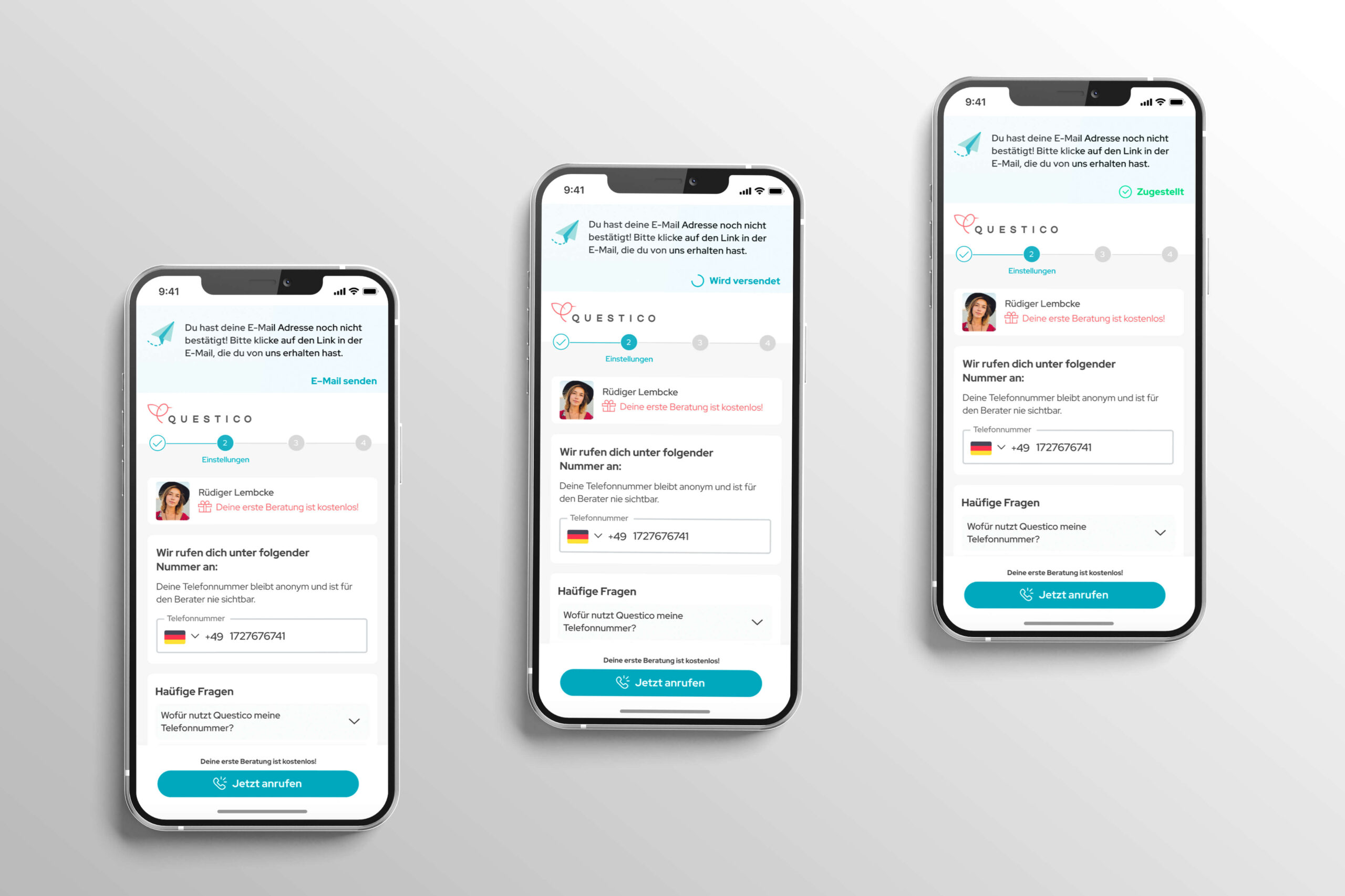
DOI banner
As you can see above, the banner is placed there so the user can get relavant information about the verification of their account. In case that they didn’t receive an e-mail, they have the choice to ask for a new e-mail. My goal here is to show the status of the e-mail within the same component.
- E-mail senden (to tap on)
- Wird versendet (accompanied with a loader to show that the email is coming.
- Zugestellt
For this banner I used the following exact specs:
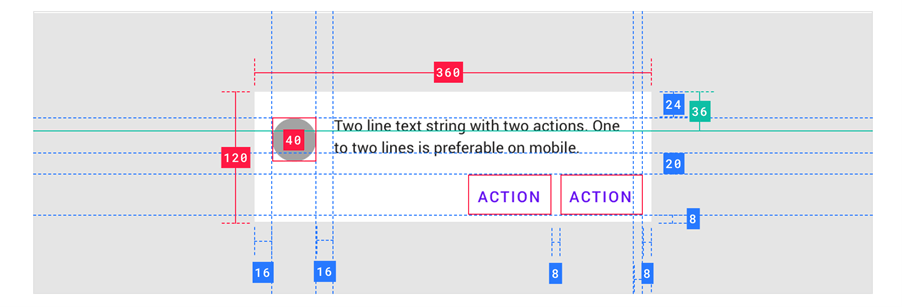
During the 2nd test phase we’ve noticed that we have quiet a few abandonments at the point where we are asking from the user to add their telephone number in order to make a call. That was expected as nobody so far explained to them how does Questico works. Actually questico connects the user with their favorite advisor. So it was important to inform the user about our key features during the onboarding phase.
For this reason, I designed the onboarding for those who are visiting the product for the first time.
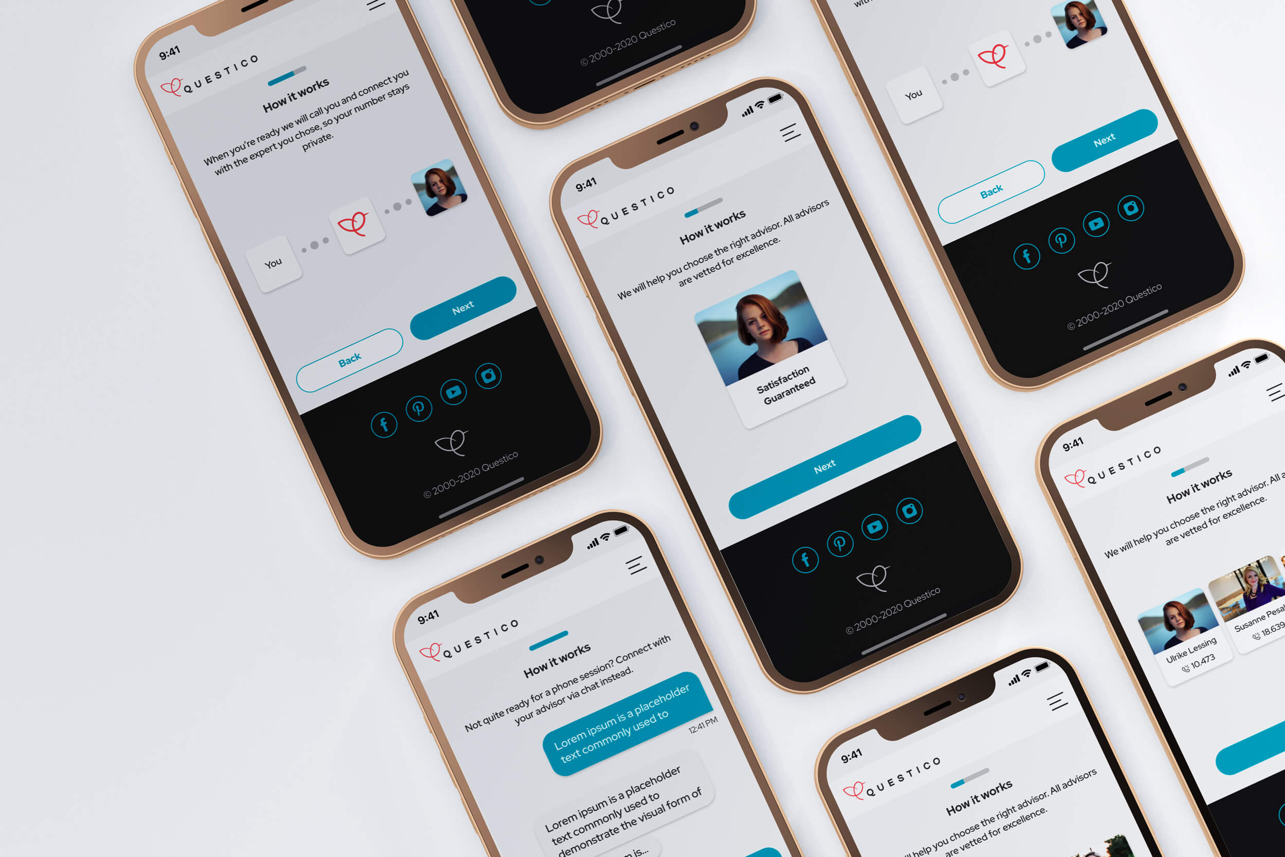
We’ve noticed that the mobile users of the product are way more than before. As chat is very immediate nowadays, we thought that it is urgent to improve the chat experience in general.
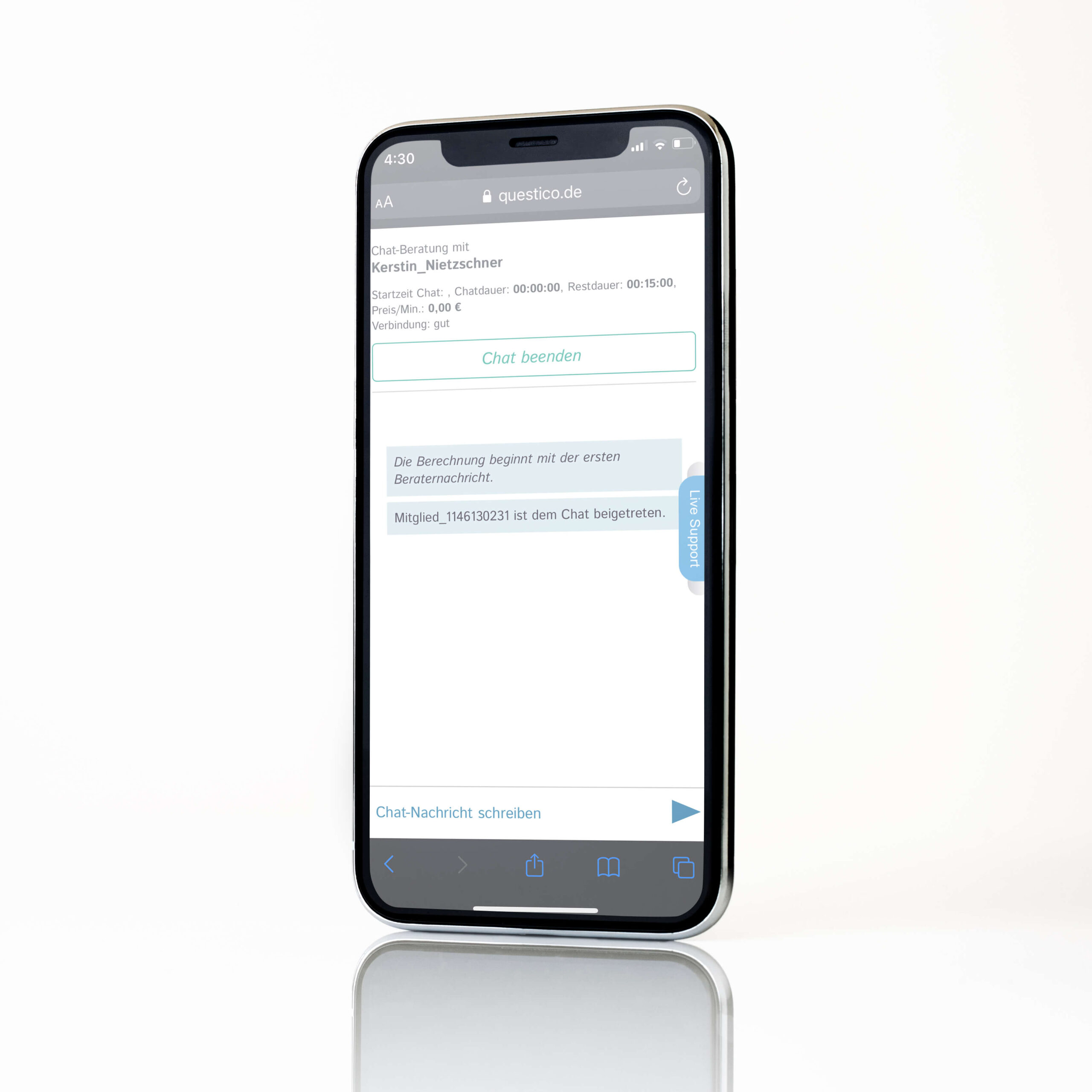
The chat before
As in every product, there are always some limitations for the new design. So, the limitation here was that I had to create a design which should be based on the existing backend. There was no time and budget for something bigger at that moment.
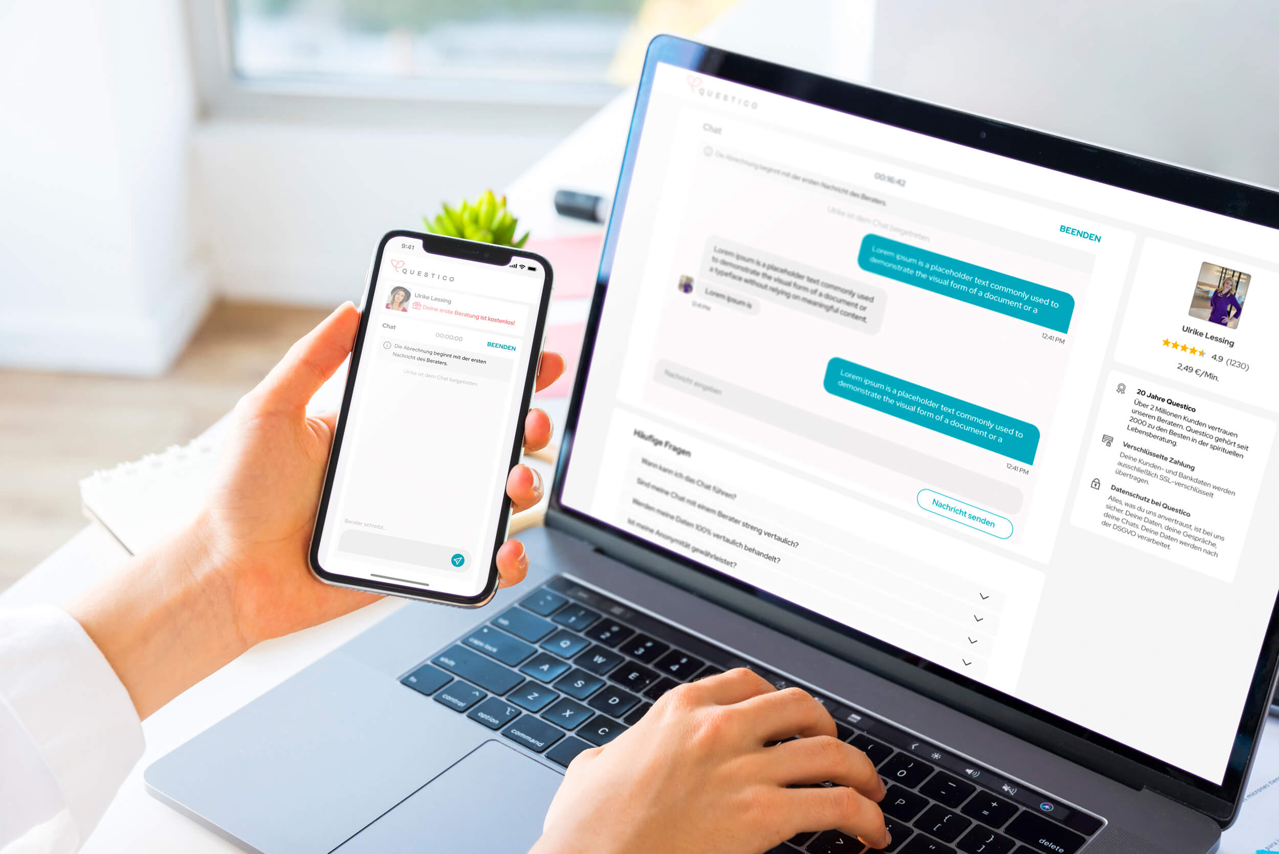
The chat now
So:
- I replaced the primary and secondary colors with our new colors from our brand identity.
- I changed the UI of the text boxes with a radius that is commonly used in our new FE.
- I added a small profile picture which indicates the advisor the user is chatting with, so it reminds of the common behavior of other chat experiences that the user has for example from famous platforms.
- I reduced the size of the “chat beenden” button. Of course, we don’t want this to be so prominent as it is in the old front end. We wanted it to be visible though.
- The header in the old FE contains information about the duration of the chat and the remaining time that the user has when they have bought a package. For the new FE I added a timer on the top of the chat box which shows the duration of the chat in the case that the user has chosen to pay by the minute and another timer which shows how much time has remained for the user who bought a specific package for 30’ for example.
Conclusion
Overall, this is the way I follow in order to deliver efficient and promising results. To be based on data and finding solutions on proven problems is one of my Principles. The second principle of mine is to prove that my design solutions improve the numbers in a positive way only ![]()
