Movietrackr
A landing page is the best way to promote a product or service on multiple platforms to get more potential customers. The successful Landing Page should contain:
- A clear conversion goal and every element on the page supports this conversion goal.
- At least one CTA button, so that the user will use it.
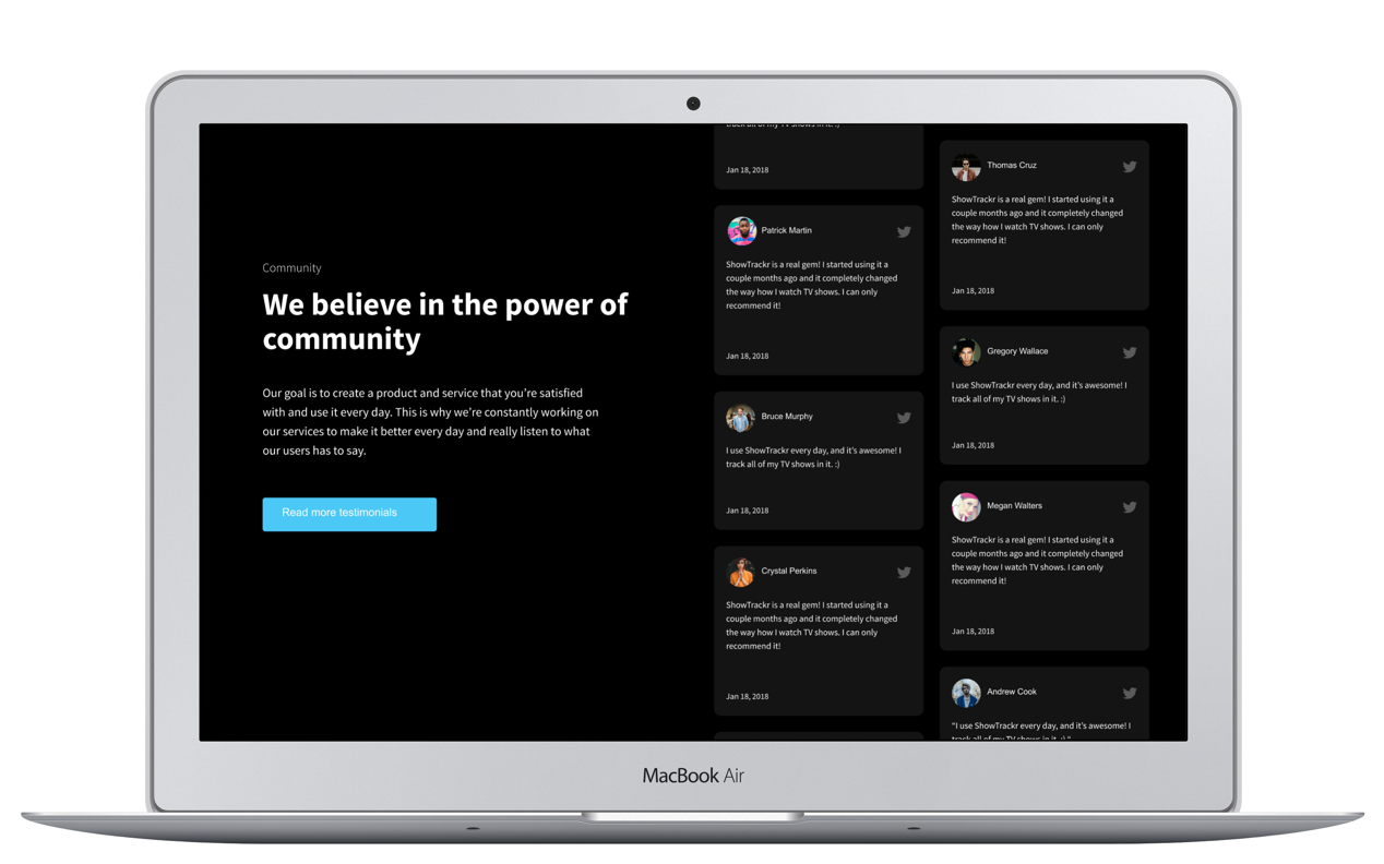
- Testimonials or customer stories. In that way you provide social validation.
- Subheadings and bullets to make a long content easier to read.
The Challenge
Lately, I set myself a challenge to design a landing page, with the following points in mind:
- It has to follow the points mentioned in the previous section (points in the most important elements of a successful landing page part).
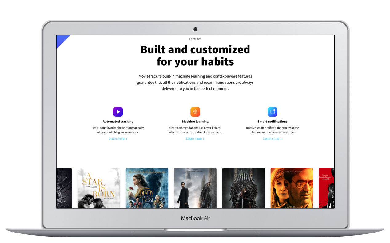
- It has to use common landing page design elements such as the 3-feature-section and testimonials.
- It has to be in line with the latest design trends on Dribbble (e.g. bold typography, use of subtle shadows, gradients, rounded corners on cards)
Project Details
- Business goal: Get more users using the platform
- Conversion Goal: Users start the sing us process by giving their email address.
- Target Group: 15-30 years old tech gigs
Design
During the design execution, I started with the Hero section first, since this is the part, which the users will see first after the page loaded.
The layout I chose for the hero section is a two column layout, because this way the user can immediately connect mentally the main message with the visuals. I placed the text group on the left side of the layout because according with the F-shaped reading pattern the users will start with the main message first.
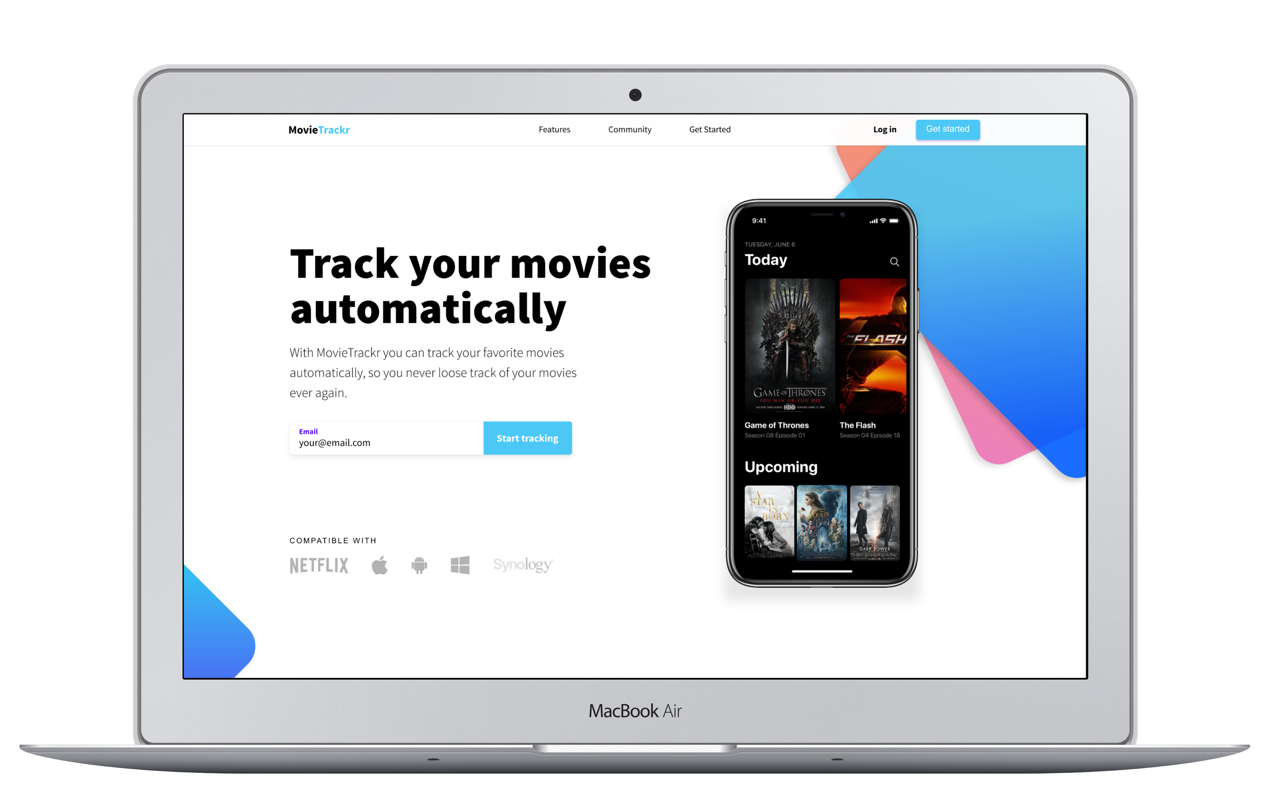
Using the big gradient rectangles has double purposes. One of them is that it draws attention to the visuals (in our case the iOS app within the iPhone X mockup). The other one is that it makes the overall look & feel of the hero section visually more appealing and more modern.
The purpose of the third, blue gradient rectangle in the bottom left corner is to subtly show the possibility of scrolling and balance the left and right side of the design.
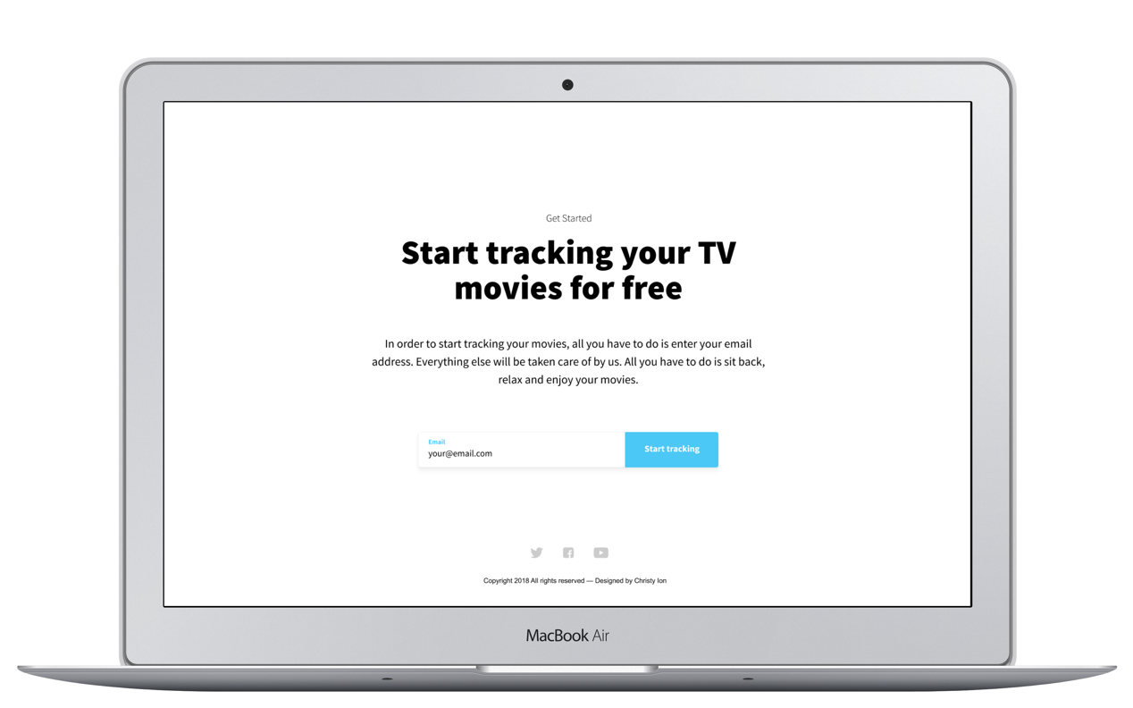
About the placement of the CTA buttons, I used them to provide a frame for the structure of the landing page.
The most important CTA part is in the hero section, so the user can immediately act on it. Placing logos of partners below it can also reinforce the decision of the user.
In case the user is not convinced right away and need more information before using the CTA button, there is a permanent ‘Get started’ CTA button visible in the fixed positioned navigation bar. This way a CTA option is always visible during scrolling and discovering the content of the landing page.
After the user became sure and familiar with the brand and its services as well as the testimonials, there is one final CTA section at the end of the page. Using a center aligned approach here ensures that there are no distractions that can get in the way of using the last call-to-action option.