Perfecting the TV Applet
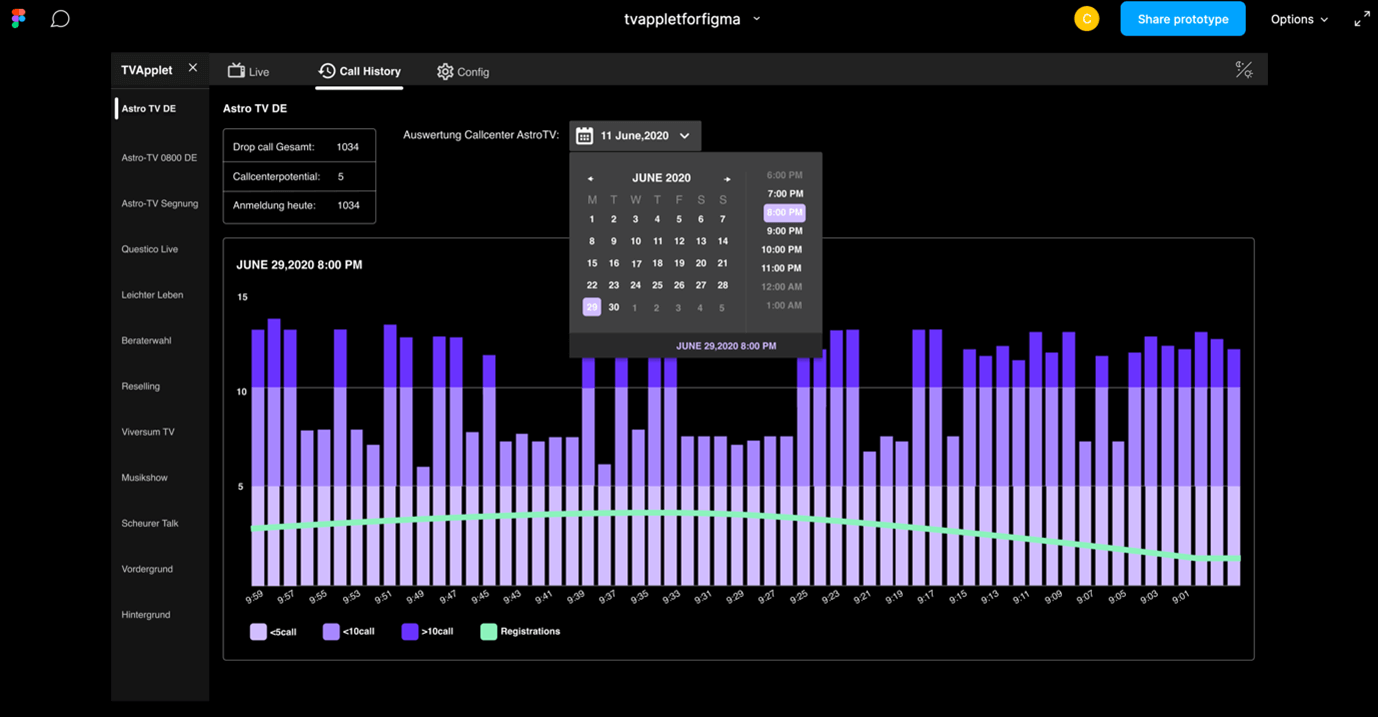
The TV Applet is an internal tool which is used by the producers in Astro TV, in order to monitor and drive the TV shows. By using this tool, the producers monitor incoming calls and they connect the users with the advisor who is “on air” while being live on a show.
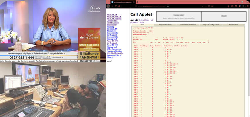
This internal tool was designed by developers only and it was used by the producers for many years.
The Challenge
What is expected, is that we need to redesign the TV Applet. The challenge is that we now need to take into consideration that there are also color-blind people who are using the tool.
Our goal for the project was to create a new, good looking and easy to use control panel which servers both, normal vision and color-blind people at the same time. A higher lever goal was to merge different pages so that the user can see every important feature at the first place.
Below I will explain you the previous functionality and the changes that me and my team introduced step by step.
My Role
UX Designer of the TV Applet. Collaborated with one other designer from the beginning, 16th of April 2020, until the end of the project.
In addition, I worked alongside a full-stuck developer and a Product Manager.
I stopped working on the project during the detailed visual design phase as the tool started to be built.
The tool launched in October 2020!
Understand the Product
Before beginning with some draft designs, I find it necessary to understand every single part of the product in order to make efficient changes later on. For this reason, me and the other designer, decided to visit astroTV and to observe the work of the users during a typical day.
Below you can see one of the main screens that the producers are using daily.
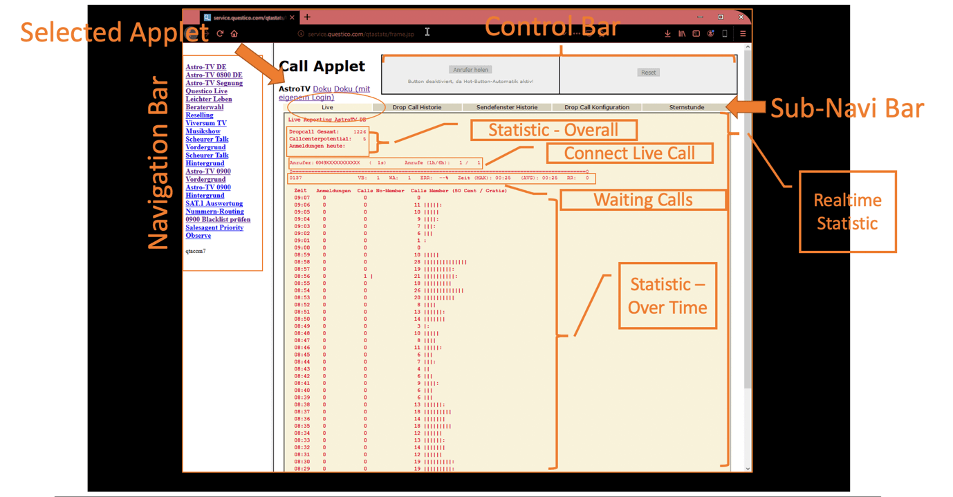
I already had in mind what kind of UX changes I wanted to do.
Very briefly:
- To make the control Bar more prominent and separate the button with which a producer accepts the call with the one with which the user denies a call.
- To visualize better the statistics
- To give the user the opportunity to hide the menu bar as it takes a lot of space in the screen and they don’t really use it as we noticed from the observation.
- To merge tabs from the sub menu
Ideation
During these times that we are all working from home, we replaced the white board that we were using for the ideation phase, with the Miro board. On the Miro Board we collect resources, design draft wireframes and user flows.
So, I began researching for the key elements that can enhance the usability for all user, including those with low vision and color blindness.

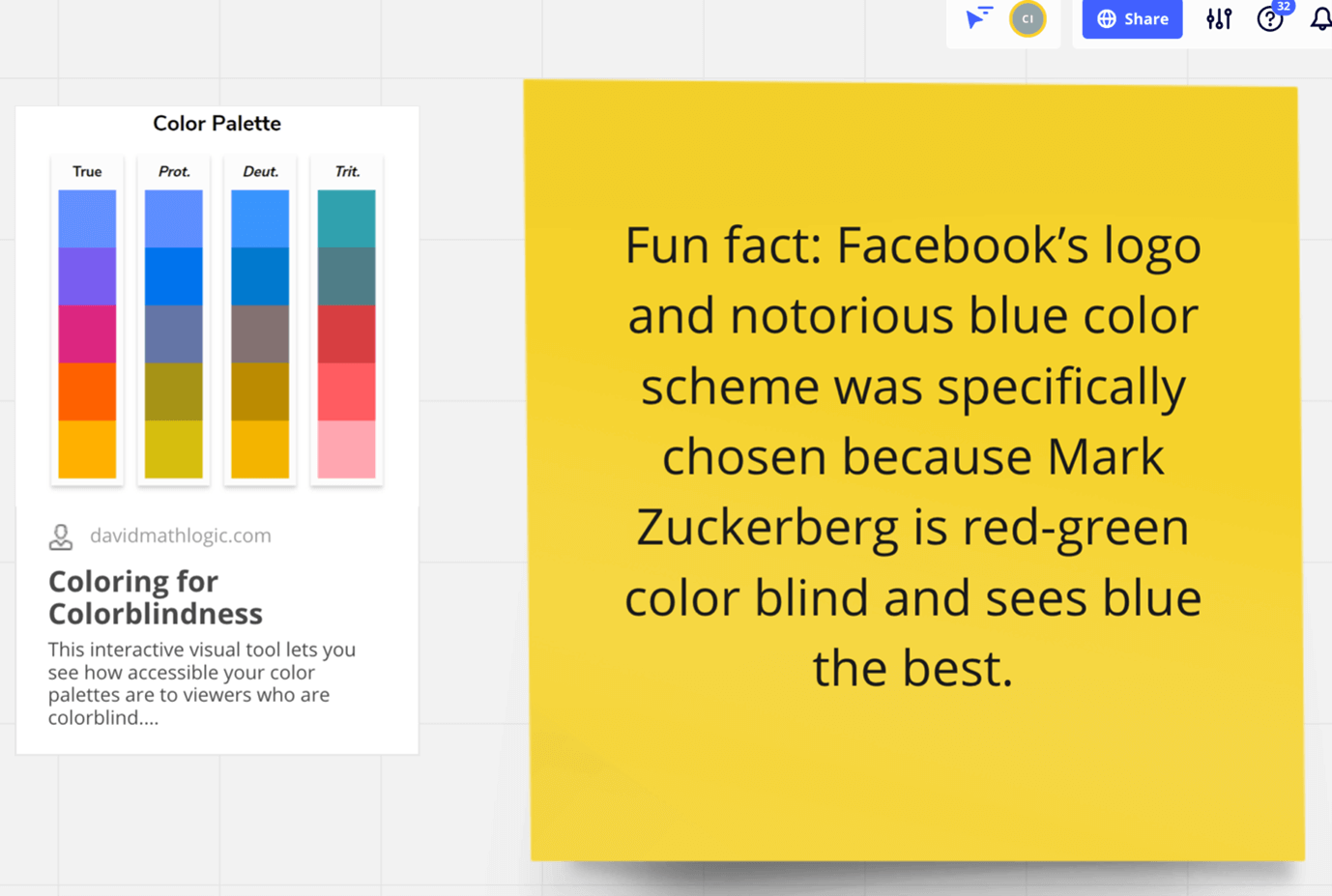
Color combinations to avoid for people with color blindness include:
- Red & green
- Green and brown
- Green and blue
- Blue & gray
- Blue & purple
- Green & grey
- Green & black
Some extra takeaways from the resources we used:
- Don’t only rely on color to convey a message
- Keep your color palette limited to 2 or 3 colors
- Use texture and patterns to show contrast
- Carefully select any contrasting colors and shades
- Avoid using bad color combinations
- Add text labels to color filters and swatches.
- Underline links to differentiate between regular text and anchor text.
- Use size, placement, or font weights to make primary buttons stand out.
The new Design
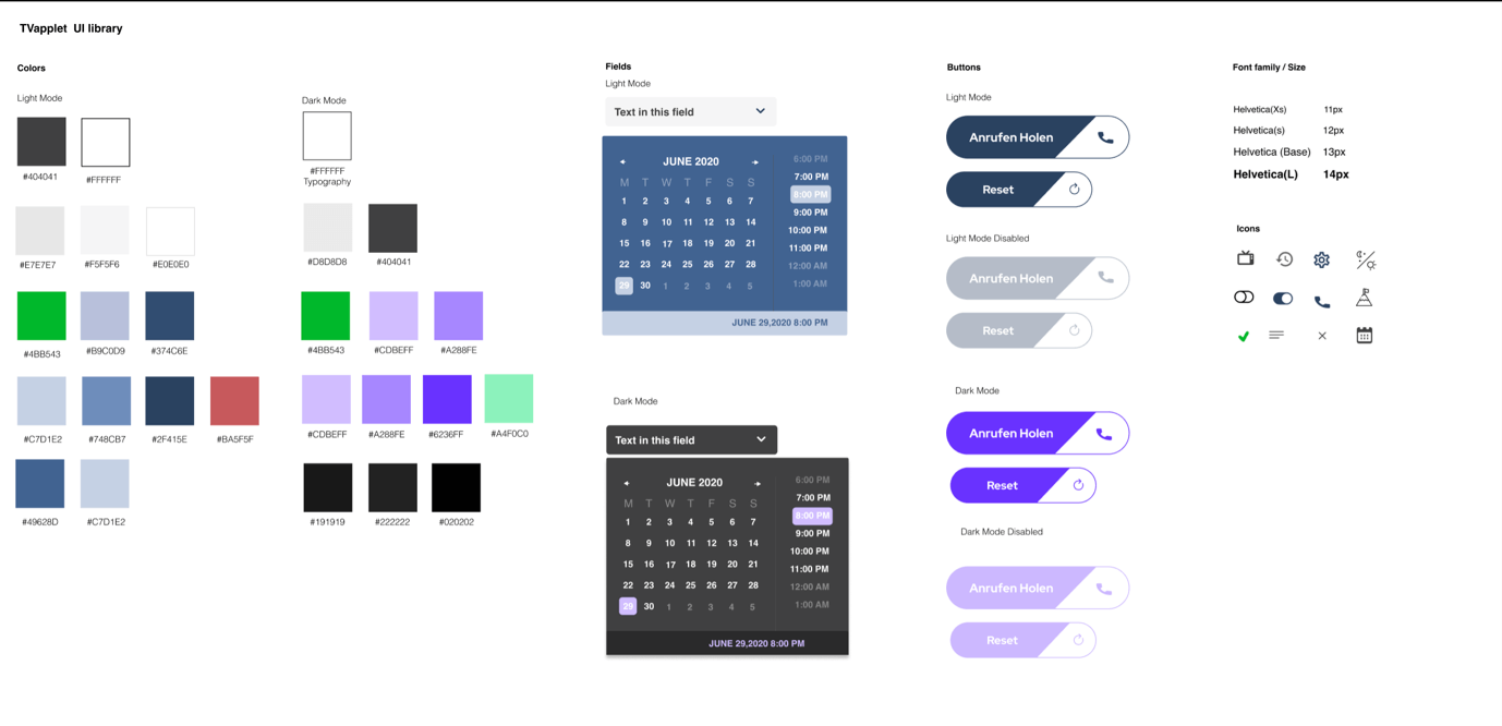
Above you can see our library. Having an updated library helps me collaborate better with the Frontend developers and other designers.
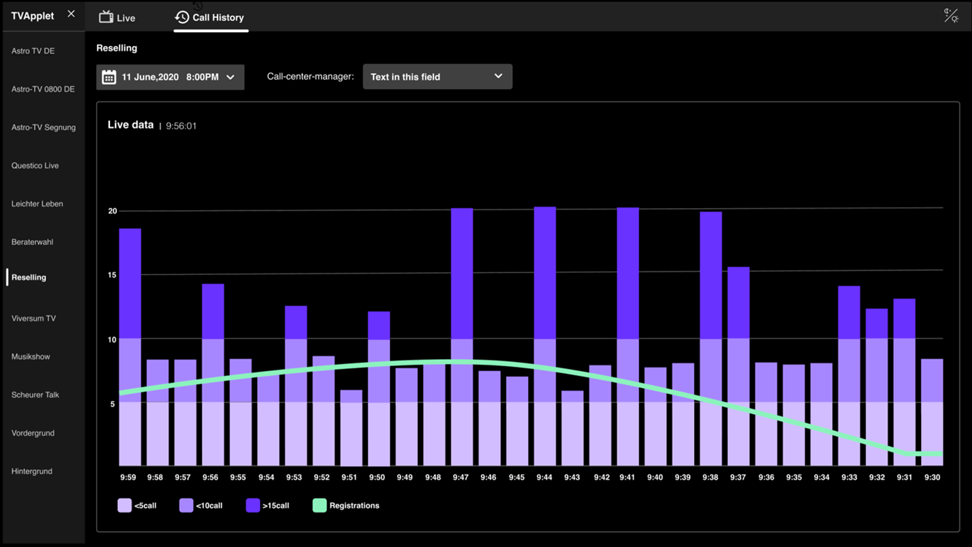
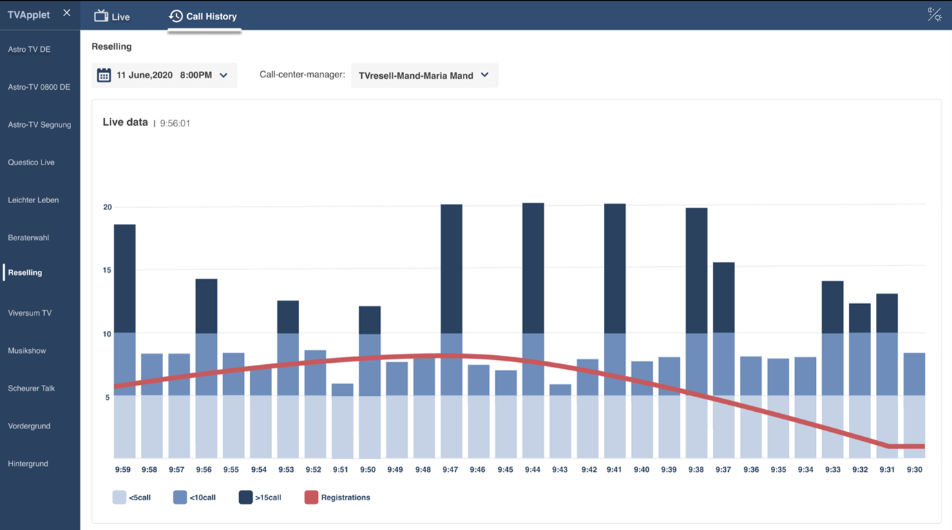
Here in order to give a great result for all of our users we decided to design both, a light and a dark mode. So above you can see the color palette of light and then dark mode, UI date picker, CTAs, Icons and Typeface.
I will be happy to give you more information about this project.
